Showing posts with label color. Show all posts

Tuesday, March 7, 2017

Romance Without Words

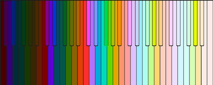
My final stab at this method of translating music to color was this piece by Gabriel Faure, ROMANCE WITHOUT WORDS. It is interesting that artists continually try to say the same thing in different media.
I tried to indicate a little bit of the dynamics in this piece by having the color take up more space when it was louder.  I will try this, and other pieces using this method again and not fade each note into black, as I have done so far, as this creates a line between colors and doesn't actually represent what happens to notes in a musical piece.  I think the whole thing should fade at the edges of the screen instead as the piece gradually sinks into time.

I do think these colors are rather romantic so perhaps Faure has transcended yet another medium.

Sunday, February 26, 2017

SCRIABIN

Still trying to perfect the way the colors appear on the screen I decided to see how they would look if they gradually moved down the screen while they were disappearing.  That way the viewer would see the color for a longer period of time.

I used this Scriabin Prelude because of the way it uses pauses.  This gives the colors a chance to be seen and appreciated.


Friday, February 24, 2017

Chopin Nocturne

In this on going exploration of how notes can be arranged in space, still using a one to one correlation between notes and color, I kept experimenting with different music and different ways of placing the notes on the screen.  I kept the Lighter colors at the top of the screen and the darker colors at the bottom of the screen.   Then each note was programmed for a complete piece of music and this whole group became a symbol which I could then place on the screen as many times as I wanted to in any place I chose.  I wanted to duplicate the symbols so I could get more color on the screen.  This also allowed me to create unexpected patterns over time.

Here is a Chopin Nocturne.

Thursday, February 23, 2017

Claire de Lune

Now that I am free to do whatever I want with the colors in space - still keeping them tuned of course and using a one to one ratio of colors to notes - I thought I would experiment with different arrangements in the same piece of music.  This is one of my all time favorites.

CLAIRE DE LUNE
https://youtu.be/FLaFQ_ZzbIQ

Tuesday, February 21, 2017

Albinoni

Since I now was animating music that would not be so simple to design code for I figured I might as well try various methods of putting the colors on the screen.  Suppose the notes moved across the screen more or less mimicking the way we read, from left to right one measure at a time?  Here is an example of that idea with the lower notes staying put and the high notes dancing across the screen.
In the repeat of the music the higher notes stay put for comparison.

ADAGIO IN G MINOR, Thomas Albinoni


Monday, February 20, 2017

moving on

After experimenting with this method for a while I began to see some trouble having each note occupy a specific place in space.  It was fine for rounds and in Pachebel's Canon I simply allowed the notes to take up arbitrary space as it was a very simple piece.  The problem was that as music began to use a wider range of notes from high to low, in order to fit them on the screen they had to be very small.  This meant that the color interaction was not as intense and since I assume the color interaction is key to the enjoyment of color music this  presented difficulties.  In this Mozart piece I changed the arrangement of the colors in the repeat of the piece to allow more color.  It is more interesting but didn't really solve the problem for music that uses several octaves of music.
Mozart


And so I decided to abandon the idea that each color would have its own place on the stage.  This would vastly complicate a programmer's job unfortunately.  Now I decided in order to keep the colors close to each other so that they could interact with each other maximally I would place them on the screen close to each other.  I still kept them in order from light to dark but they did not have a specific place in space to call their own.  It might still be possible to design a program that would be able to interpret this arrangement but I'm not sure. I could see how it looked and hope so.

Here is the first result of that method of animating.

Chopin


Saturday, February 18, 2017

More Rounds

As you can see the rounds designed in this way do make interesting patterns.

This brings me to speculate about our ability to alter sound waves with our throat and mouth.  How about that!  We can sing.  WE are the first musical instrument.   We also can hear those altered sound waves and somehow be moved emotionally by there combined effect.  If we could alter light waves with some part of our body we could create color in time ourselves.  Since we can't do that I will continue to try to figure out how we can use modern technology to do it for us.

Going back to that exploration I animated Pachebel's Canon.  I tried to stay with classical music that is simple and popular.  I was pleased to see that these colors are quite pleasing.  There is some primitive attempt to capture dynamics by making the louder notes larger.  The music was again programmed by my grandson Luke who was then in high school and is now a lawyer.  So much goes on in a young life in a short period of time.  But of course time takes much longer when you are young.


PACHEBEL'S CANON


Friday, February 17, 2017

Back to Color and Music

Back in July I explained how I created paintings and prints by translating music to color.   I am going to take up this discussion again now.  This is more or less how I work.  For a while I paint and then I start wondering about music and color and begin to work on that again.

After making several paintings and many prints I really was itching to try to translate music to color in time.  I recognized that without an instrument that would allow someone to play colors in real time there would never be color music, but since I was unable to create such an instrument myself I decided to at least animate music in a way that could be used as a template for such an instrument.
There is a rich history of artists who designed color instruments which you can check out on Wikipedia.

However, none of these instruments has come into popular use and none of them are constructed as I would.  My theory is that any instrument must have a set of colors tuned from dark to light with a complete spectrum in each octave.


But how will the colors appear in space and time?  Each note has to be placed somewhere (space) and be played in real time.

I decided to try and translate music to color starting with the idea that the colors would be located on the screen from top to bottom with high notes being at the top of the screen and low notes being at the bottom.  Each note would be a circle of color that would diminish slowly as it disappeared.  I purchased Flash Professional CS3 and set to work figuring out how to use it.  First I had to make a file for each note.  When that was accomplished I imported music or had my grandson, Luke,  program music for me in Garage Band.

My first pieces were rounds as they are simple.  The music appears as a wavy line on the bottom of the screen in Flash under where the notes are to be placed.  In order to animate each note one must locate a change in the line and place the note at that change. It is a very tedious business.

 Each note has its own space.  Donna Nobis Pacem,  Give us Peace.

Tomorrow more rounds.


Wednesday, July 6, 2016

BACH

Finally we are up to Bach in my very truncated history of music.
I have chosen a simple piece, THE MINUET IN D minor as it is easy to see the color relationships and it is a simple but satisfying 8 measures.
Go HERE to listen to the whole piece.

Top part


Bottom part


Together


It would not be fair to present Bach without a fugue and in fact the ideas that hold a fugue together inspired a great deal of my work in fiber so next post I will present a fugue.  I have not created one yet so it may take a while.  Meanwhile I will search for a simple but beautiful one to work on.


Wednesday, May 25, 2016

THE COLOR OF MUSIC 2


Although there was never a time in my life that I was not making some form of art, after my four children were off at school, I decided to go back to college to get my degree and see what I could see that would inform my work.

At that time at the University of Pennsylvania they taught Josef Alber's course the interaction of color.  Neil Welliver, then the head of the department of Fine Arts went to Yale where Albers taught.  As a result the thrust of the department was a combination of the Bauhaus courses of Albers and painting outside from nature.  Welliver painted outside in Maine.  My instructor in painting was Rackstraw Downs who paints very large panoramic views of New York while sitting on the street.  I have been painting nature and examining color ever since.

In the Alber's course it is necessary to see the way one color changes another when they are juxtaposed in order to complete various exercises.  It is really the only class in art I have ever taken that taught something that is not subjective.  You see it or you don't,  but it really does happen.

This changing color felt like music to me.  Could there be a way to present colors in a sequence that would move the emotions the way music does?


Gould's Hill
Neil Welliver


80th Street and Broadway
Rackstraw Downs


....to be continued

Please share with anyone you think might be interested.


Tuesday, May 24, 2016

The Color of Music

People have asked me how I arrived at my ideas about color and music and what inspired me to spend so much time on this project.  So I here we go.  A lot of this material is covered in my book IF C IS RED, with many illustrations, but this is a more personal story.

My mother was the youngest of three sisters.  The oldest played the organ and painted, the second had a beautiful singing voice and painted.   My mother, although she played the piano and sang, never felt she measured up to her older sisters.  She had two unhappy marriages, and although she finally married someone who was just right for her, most of my time growing up was spent trying to cheer her up.  She was thrilled that I showed some talent at painting.  I was pretty much a failure at playing the piano however.  Is it any wonder then that I ended up trying to make art out of music?  This was certainly not a conscious decision but it does seem like a probable underlying motive.


I love music and really had a strong longing to make color sing in the same way that music makes sound sing. The more I thought about this, the more it seemed to me that if color were arranged in the same way that notes are, that might be possible.  So I began by constructing a color keyboard.


to be continued.....

share this with anyone you think might be interested please.

Sunday, January 3, 2016

DECEMBER 2015

It has been a very strange December.  No cold weather to speak of and no snow.  This has left me feeling a bit confused. I don't like cold weather but without it things just seem wrong.  The leaves are gone and the days are short but by the end of December there were plum trees in bloom and lily leaves starting to come up.  What next?

At the same time I have been experimenting with new types of painting support.  I am using a very hard flat surface called gesso panel.  Unlike canvas which absorbs some paint and has a semi rough texture this support is flat and hard.  I wanted to see if I could build the paint up a bit, creating texture with the brush as it left ridges while using a lot of paint.  In order to create areas that were defined I simplified the drawing so that each shape was discrete.

I wanted the color to say something without too much reference to the "scene".  So far the results have been mixed.  My latest painting somehow turned out quite different from what I planned and I am beginning to loose interest in this approach.

I am including my reference photo - the one I planned very carefully on the computer- and the finished work to show how things went wrong.  I'm not sure how I got so far away from the colors I had  planned as the combination of color is what I was interested in.  The feeling of the colors in the plan is quite different from the feeling of the colors in the final painting.  I wonder what happened.  It is the feeling of the colors in the plan that I was after.  That is how I feel about this December.   I am going to print it out on soft archival paper with archival ink.   I suspect my natural cheery nature took over and I simply needed to paint some bright color.


December 2015 plan


December 2015
9" x 12"
oil on gesso panel


Tuesday, November 17, 2015

AUTUMN 2015

Since I have been sending out a monthly newsletter I have been giving the news more thought.  Why is it that the news consists of disastrous things that happen in the world?  Every day wonderful things happen as well.  These stories are usually presented as "human interest" if at all.
I am taking a personal stand for good news starting today.  This fall was a real stunner.  Autumn in the Northeast is always nature's inadvertent gift to humanity before the grey of winter sets in, but this year the combination of lots of rain in the spring and warmer weather in the fall left us with color that was spectacular and long lasting.  Even now as I look out my window the sun is lighting up the brilliant red of the trees in my yard.
So here is a short story hot off the presses.

PENNSYLVANIA HAS RECORD BREAKING BEAUTY IN FALL MONTHS!
Watch video for on the spot reporting!

https://youtu.be/bFWTUzlyjcs

The opening shots are from my yard featuring my two Katsura trees, which not only turn a brilliant yellow, but smell like burnt sugar in the fall.  The remaining footage is from Chanticleer gardens.


Friday, August 2, 2013

Coleus


Coleus #2
Nancy Herman
9" x 12"
oil on canvas board

This combination of coleus, sweet potato vine and the Cordyline Australis with its exotic bluish leaves is one of the best color combinations I have 
found for my barrel of eye fun.

$350.00

Saturday, February 16, 2013

ROMANCE WITHOUT WORDS


In honor of Valentine's Day, if a little late, this is my latest music video, an animation of Romance Without Words by Gabriel Faure.  Even though in the process of animating this piece I have listened to it hundreds of times I still love it.  The transference from Flash to .mov was not perfect but I am moving on for the time being.
Be sure to click on the small square at the bottom of the image to see it full screen for maximum pleasure.


Thursday, February 14, 2013

VALPARAISO COLOR


VALPARAISO COLOR
6" x 8"
oil on canvas board

It was so sunny and warm in Valparaiso I stayed a few days thanks to Google maps.  I cought this young woman helping to keep these cheery, colorful houses clean.  I really love the color of that drain pipe but the raspberry building with the dark red windows is also delicious. Thank you Virtual Paintout for taking me on vacation without the hassle of leaving the house.

$150.00

Friday, January 18, 2013

Chopin Prelude


While I'm waiting for a painting to dry I thought I would post my latest translation of music to color.  I chose this Chopin Prelude because it is short, fairly slow (so I can hear all the notes) and dissonant.  I want to see if the dissonance I hear actually looks dissonant when translated to color.  This is a very sombre peice with several key changes.  Very often there are two notes adjacent to each other.  The colors make me uncomfortable.  What do you think? Check it out one minute and 56 sconds.

Monday, November 19, 2012

Bach Polanise in G Minor

I have not been painting as much as usual because I wanted to work on my latest translation of music to color.  I am trying out a new "instrument".  I have felt for a while that in order to see the music better it is probably important to keep the notes on the screen for a while and have them roll out of the center and dissappear into the sides of the screen.  This way the translation from one note to another is not so abrupt.  Here is the second piece I tried using this method.  I got some, but not all, of the kinks out on this one.  On my Mac the youtube version is not as smooth as I would like it to be but some people who have PCs say it looks smooth on their machines.  Next piece I will be dealing with dynamics.  What is good about this method is that it really could be played in real time if I only knew how to hook up the colors to the keyboard.

Let me know what you think.

http://www.youtube.com/watch?v=oXLtvzZBeMo&list=UU0kTuj7G2coHnSXm8-pg-4g&index=1&feature=plcp


Friday, November 11, 2011

WHITE HOUSE ON RAYNAM ROAD


WHITE HOUSE ON RAYNAM ROAD
Nancy Herman
8"x 6"
oil on canvas

On these beautiful autumn days it is a good time to observe the way colors are influenced by what is nearby.  Here this lovely old house is many shades of white depending on where the sun is and which tree color is bouncing off its surface.  Color interaction is one parameter that we can observe that gives us hints about a phenomenon that is always going on,  all things are connected and interact in ways that are seen and unseen.

$125.00


Monday, June 13, 2011

Poppies and Lettuce Garden


The delightful, delicate dance of Poppies through the saucy salad of lively lettuce is just one of the eye pleasers at Chanticleer.  (If you think I went overboard with the alliteration please appreciate that I did show some restraint by not making it "pretty" poppies).
Seriously all the many gardens at Chanticleer are filled with surprising color and unusual combinations of plants.  There is a living art work everywhere you look.