

Winter finally arrived this month and even though I hate the cold I was glad to see that things were back to “normal” for the sake of nature. Plenty of art to see and a small contingent of our art lover’s group did manage to see several exhibits at Woodmere Art Museum. We were fortunate indeed to have a private tour led by museum director Bill Valerio. Bill has really created a kind of heaven for Philadelphia artists and art lovers as Woodmere produces one interesting show after another using the art of predominantly local artists.

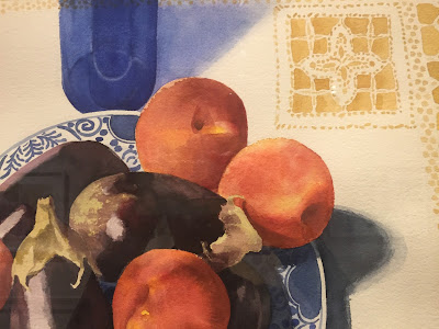


The glorious show of Eileen Goodman’s water colors really took my breath away. If you have ever struggled to control water color media you have to be in awe of these large carefully managed pieces. I could not help but wonder why one of these beauties was not included in the still life show at PMA. These paintings should be seen in person as the delicacy and scale of the work is amazing. The show is there until March 13th.

STILL LIFE WITH BLUE GLASS
Eileen Goodman

STILL LIFE WITH BLUE GLASS
Eileen Goodman
(closeup)
Next we moved on to the large show in the grand rotunda space LOOK BOTH WAYS : ART AT THE CROSSROADS OF ABSTRACTION AND REPRESENTATION
This is an interesting conceit. Is it the abstract qualities of a painting or sculpture that make it memorable? Does the reference to “reality” disqualify a piece of art from being a strong abstract composition? These are a couple of the questions that come to mind when looking at this selection of art.
In Bruce Pollock’s work FRUITFUL DARKNESS he has created a form that seems quite organic using abstract elements, yet it has nothing to do with the representation of any living plant.

FRUITFUL DARKNESS
Bruce Pollock
oil on canvas (inset)
This book made out of cut out paper and paint certainly has references to reality but the references are not what makes it arresting. It is the juxtaposition of the paint and the paper and the choice of color, all abstract elements.

UNTITLED BOOK
Bettina Nelson
PAPER, ACRYLIC AND GOUACHE ON PAPER
This handsome painting definitely represents an easel but the painting is really about orange and blue. I was surprised to note that the blue and orange never directly touched, which would certainly have set off a strong vibration. There is a margin of three or four colors carefully laid down between these two colors at the opposite end of the color wheel. Very interesting and quite effective.

MIRROR
Joshua Marsh
This painting by Stuart Shils is one of the most representational works in the show, but like all of Shils work it is very loose and painterly. Shils often creates paintings that are completely abstract with no obvious connection to representation and here there is a strong sense of composition, but the sky is up and the buildings are down and it is definitely a street scene. The ability to keep a feeling for paint, an eye to the reality of what you are seeing and a strong composition is a skill that very few possess. It is a juggling act well caught by Shils. The buildings dissolve into paint and make the city seem mysteriously beautiful. No graffiti on these walls.

PHIL-ELLENA and QUINCE STREETS, MT AIRY
Stuart Shils
oil on linen
I recommend both of these shows. One for its simple beauty and the other to stir the grey matter.
Earlier in the month I visited my good friend Eleanor Schimmel’s show at Rosemont College’s Lawrence Gallery. It is a beautiful show of her encaustic paintings. In this group of work she lays down many layers of color and then digs into the surface to expose the layers. Her surfaces are rich and voluptuous and the colors, partly because of the waxy texture, really sing. There are occasional sprinkles of glitter on some of the paintings adding little fragments of colored light. Here is a close up of one small painting. You can see here the amazing variety of subtle color created by the combination of paint, wax and glitter. These paintings should be seen in person to appreciate their complexity. The show is up until March 4th.

fragment from
UNRELENTING
10” x 10”
Another good friend, Alan Soffer is showing his work in West Chester at the Church Gallery.
I have not seen the show yet and it is over in 1 day so I had better hustle (you too). It looks luscious.

If you got this far - thanks for tuning in. While writing this newsletter I realized I have been experimenting all month with some of these ideas about abstraction and representation while creating ‘songs’ as I learn how to use the app Procreate on my iPad. This software for the iPad allows you to “paint” using your finger or a stylus. For me the interesting thing about it is that it records what you are doing and you can then play it back. It plays back very quickly so the whole process takes a few seconds to view. It is something like creating jazz with color, except of course it is not in real time. The challenge is to make each mark matter. The image you end up with is no more significant than any one second of the video. I have set these experiments to music which is really the fun part. This is a link to song #1 There are 10 songs and they follow each other if you stay on youtube. See what you think about the difference between the abstract and the representational songs. As you probably know if you have followed my work this is the latest series of pieces about music and color. This time the color comes first!
Let me know what you think. Talk next month.
Best,
Nancy