Friday, May 27, 2016

THE COLOR OF MUSIC 4


After I graduated from the University of Pennsylvania in 1974 I went into my third floor and spent a lot of time thinking about how I was going to go about making colors do what musical notes do so well. 

ATTIC WINDOW
Nancy Herman
8" x 6"

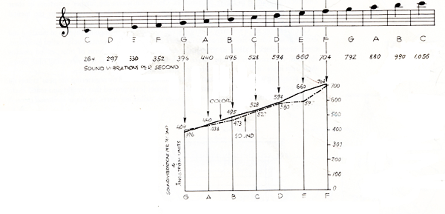
I decided to see if I could somehow “translate” music to color and see if the colors made any sense to me.  Were the results beautiful or not basically.  I had already constructed my keyboard.  I placed red in the C position because red and green are in the middle of the spectrum in terms of how light they are.  My choice of red over green was arbitrary, but years later I read that Sir Isaak Newton also associated red with middle C, so at least I was in good company.  As we will see later on it is more important that the colors are tuned in a slow progression from dark to light than that any one color is in the position of C.


Notice how red and green are about the same tone or shade.  (These terms apply to the amount of light a color reflects)  Yellow has a lot of light and purple keeps its light to itself.

NEWTON'S DIAGRAM OF COLOR SOUND RELATIONSHIP

to be continued....

Please pass along to anyone you think may be interested.

Thursday, May 26, 2016

THE COLOR OF MUSIC 3

So you can get an idea of how one color changes another, here is an exercise from the Josef Albers course THE INTERACTION OF COLOR. The two small squares are exactly the same color.  The background color changes our perception of them.   The one on the left seems darker than the one on the right and the one on the right also seems to have more of a yellow tint.


tomorrow...getting started in the attic.

Please pass this along to anyone you think might be interested.


Wednesday, May 25, 2016

THE COLOR OF MUSIC 2


Although there was never a time in my life that I was not making some form of art, after my four children were off at school, I decided to go back to college to get my degree and see what I could see that would inform my work.

At that time at the University of Pennsylvania they taught Josef Alber's course the interaction of color.  Neil Welliver, then the head of the department of Fine Arts went to Yale where Albers taught.  As a result the thrust of the department was a combination of the Bauhaus courses of Albers and painting outside from nature.  Welliver painted outside in Maine.  My instructor in painting was Rackstraw Downs who paints very large panoramic views of New York while sitting on the street.  I have been painting nature and examining color ever since.

In the Alber's course it is necessary to see the way one color changes another when they are juxtaposed in order to complete various exercises.  It is really the only class in art I have ever taken that taught something that is not subjective.  You see it or you don't,  but it really does happen.

This changing color felt like music to me.  Could there be a way to present colors in a sequence that would move the emotions the way music does?


Gould's Hill
Neil Welliver


80th Street and Broadway
Rackstraw Downs


....to be continued

Please share with anyone you think might be interested.


Tuesday, May 24, 2016

The Color of Music

People have asked me how I arrived at my ideas about color and music and what inspired me to spend so much time on this project.  So I here we go.  A lot of this material is covered in my book IF C IS RED, with many illustrations, but this is a more personal story.

My mother was the youngest of three sisters.  The oldest played the organ and painted, the second had a beautiful singing voice and painted.   My mother, although she played the piano and sang, never felt she measured up to her older sisters.  She had two unhappy marriages, and although she finally married someone who was just right for her, most of my time growing up was spent trying to cheer her up.  She was thrilled that I showed some talent at painting.  I was pretty much a failure at playing the piano however.  Is it any wonder then that I ended up trying to make art out of music?  This was certainly not a conscious decision but it does seem like a probable underlying motive.


I love music and really had a strong longing to make color sing in the same way that music makes sound sing. The more I thought about this, the more it seemed to me that if color were arranged in the same way that notes are, that might be possible.  So I began by constructing a color keyboard.


to be continued.....

share this with anyone you think might be interested please.

Thursday, May 19, 2016

Brooklyn Building #2


BROOKLYN BUILDING #2
Nancy Herman
watercolor
9" x 12"

Everything dissolves into itself on a foggy day in Park Slope.


At auction on DailyPaintworks
http://www.dailypaintworks.com/artists/nancy-herman-1193/artwork

Tuesday, May 17, 2016

BROOKLYN BUILDINGS #1


BROOKLYN BUILDINGS #1
Nancy Herman
watercolor
9" x 12"

While cleaning out my studio I found a small treasure trove of water colors of street scenes of New York. I was surprised at how spritely they were.  When I get back to painting I am going to try water colors again.

This one is on auction at Daily Paintworks. Here is a link to my gallery there.
http://www.dailypaintworks.com/artists/nancy-herman-1193/artwork